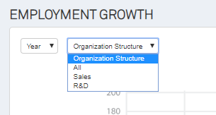
Preview: Employment Growth Analysis Chart
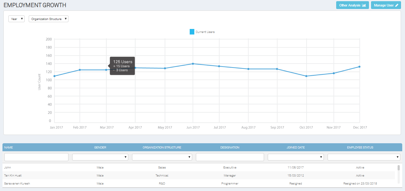
This analysis chart will specify when the employment growth accelerates and declines. The chart is spread out by months, indicating explicitly the number of users registered and removed from the organization system. Hover over the blue dots on the graph - the total number of users, the number of users added and removed will show up for an easier and quicker summary review.
The top left corner of the page allows admins to retrieve data with ease by selecting relevant years, namely This Year, Previous Year and Last 12 Months. The drop-down Organizational structure tab will be filtering the chart by the categorized department, making it more convenient for employers to create a justifiable prediction and expectation for both existing and new positions.
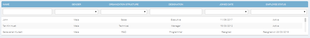
The name of the employee, gender, department from which particular user is assigned, job position, date of commencement and user’s status is allocated at the bottom section of the page (precisely under the chart).
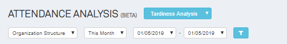
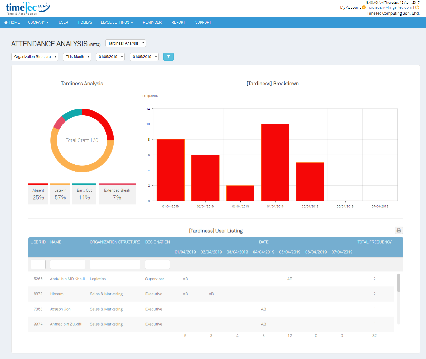
Tardiness Analysis Chart
Preview: Work Rate Analysis
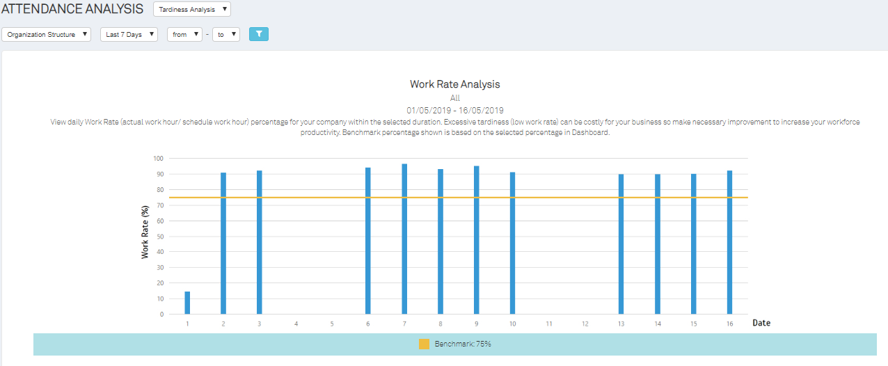
Work Rate Analysis is the study of employees’ attendance through chart patterns. Analyze the movement to make reasonable predictions about a business’s future productivity action. TimeTec TA Work Rate Analysis will be generating this analytical report to work out the trends and identify tardy employees justifiably.
The setting of a benchmark rate is added for its deemed usefulness. The benchmark can be customized by the management to decide the tolerance rate of employees tardiness. The work rate will be indicated in percentage, ranging from the lowest 0% to the highest 100%. This is going to lay out the number of employees who have or have not met the minimum tardiness acceptance level determined by the employers.
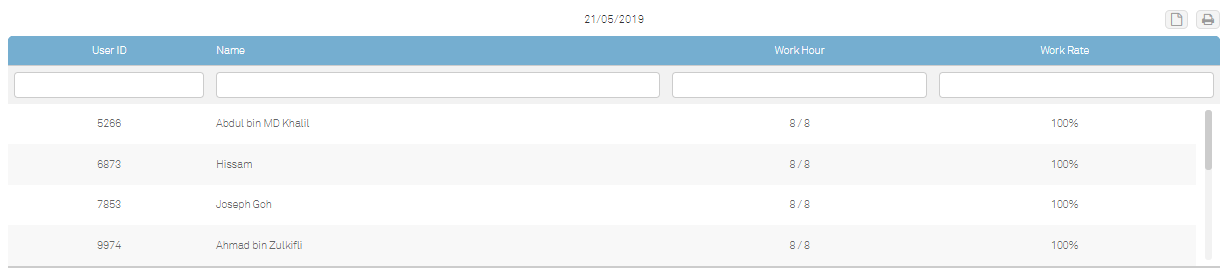
At the bottom of the page, the user ID, name, work hour and work rate will be listed out according to the graph indicated above. This section is particularly helpful with the display of the number of working hours staff is committed to on a particular day siding along with the work rate performance in percentage. Quick to view, Ease to monitor.
Preview: Tardiness Analysis (Default Mode)
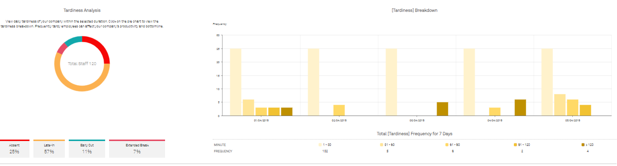
This is another type of Tardiness analysis. The above image is a preview of the default page of this analysis. The pie chart will be broken down by Absent, Late-in, Early out, and Extended break. The chart analysis besides will allow the management team to view the daily tardiness of employees within the selected duration. This is especially useful to pinpoint at the specific days and times employees are not performing well. Select a specific frequency to review the total amount of tardy time by minutes of the employees to evaluate the frequency of low productivity for easier measurement of corrective actions needed.
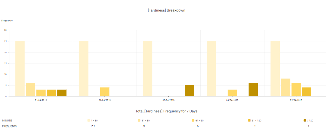
Minute is indicated with different colours for easier categorization of the range of minute (e.g. from 1-30 minutes to >120 minutes. Colours label from light to deep) The graph will then appear in different colours, all according to the attendance data sync from the biometrics terminal or the mobile clocking application.
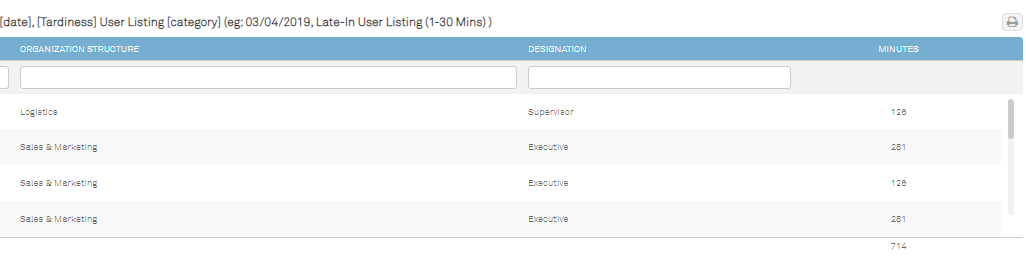
Frequency is the total number of employees report late to work. It is organized followed by the minutes labelled. The total number of tardy employees reported to work within those minutes timeframe will reflect on the graph.
When an admin wishes to view the tardy report of a specific day (one of day of the month), filter the analysis by selecting the actual date.
To give an example highlighting another important feature here in this analysis, for instance, employees who were late to work within 1-30 minutes on the 4th of March 2019, in order for the admin to view that list of employees, find the date stated on the graph and click on desired minutes as per labelled below the graph.
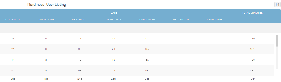
For more in-depth analysis, the admin can also click on the different colours stated on the pie chart to extract more comprehensive data for report evaluation. The above is a preview of the tardiness breakdown for Absences. It will be visible for the admin to determine what it is they are looking at as it all will be labelled in conformity with the determinable colours. This analysis breakdown is arranged by date accompanied by the user listing below revealing who, when, why and how many employees were absent. Leave no loophole for employees to give excuses for their sluggish behaviour.
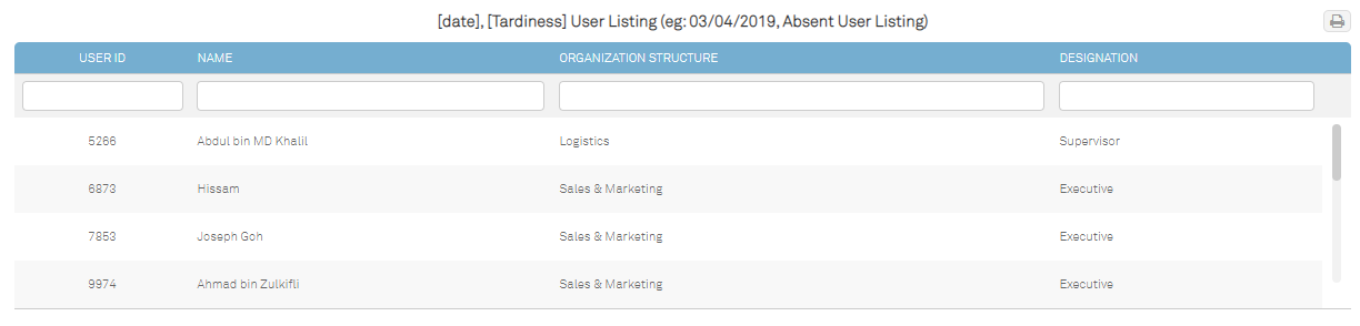
Same it applies to the aforementioned feature, click on the specific date on the graph for if you wish to view the full list of absent members. The absent user listing will change from a general overview to an itemized user listing.
Note: All of these graph analyses are printer-friendly.